
Caramel & Toffee Pouch Packaging
Laura Raes was a company born in the pandemic, and a way for owner Sheri Visakaly to escape from corporate life.
Her signature candies were such a success that her self-made labels weren’t up to snuff for long.
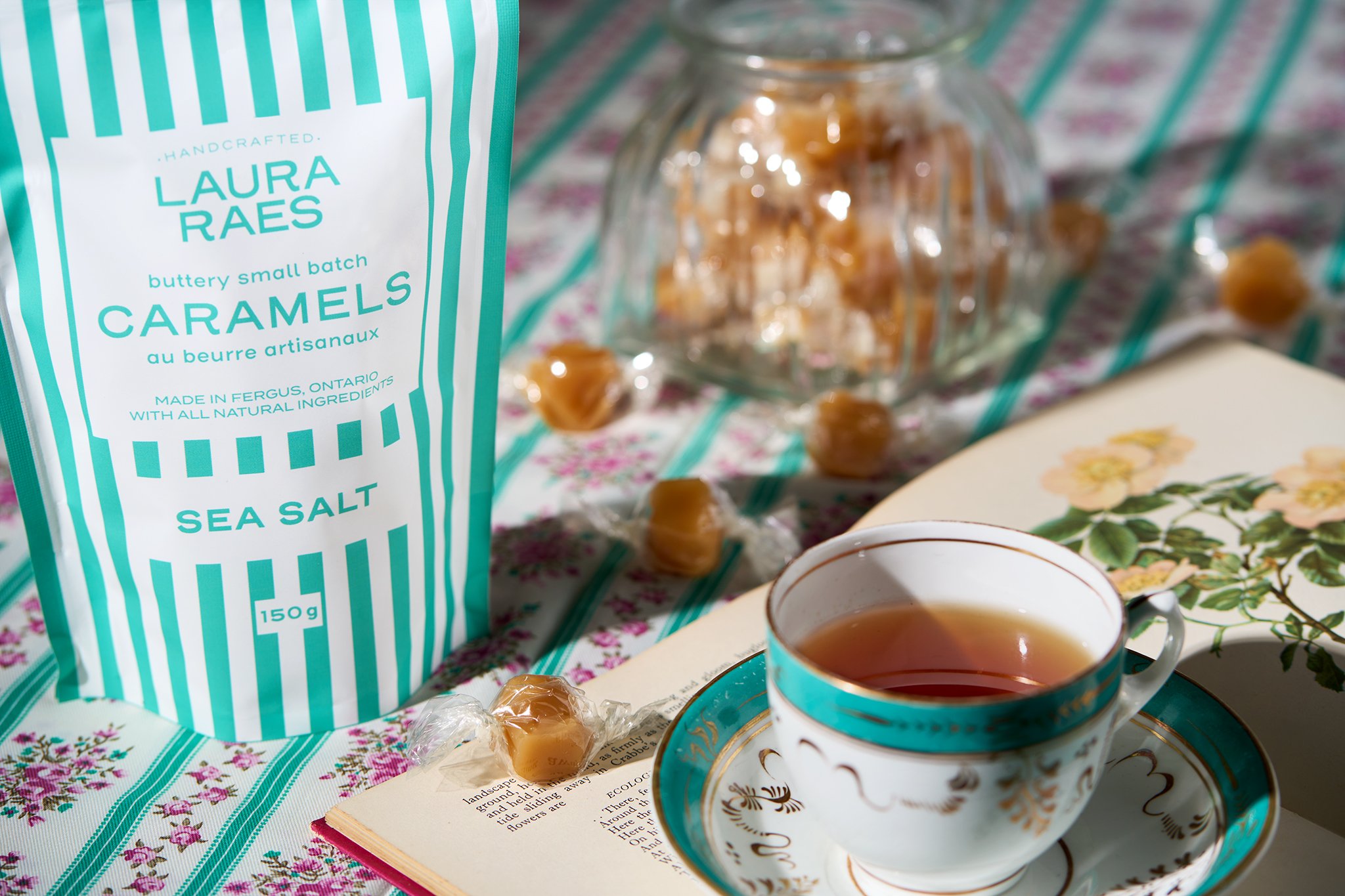
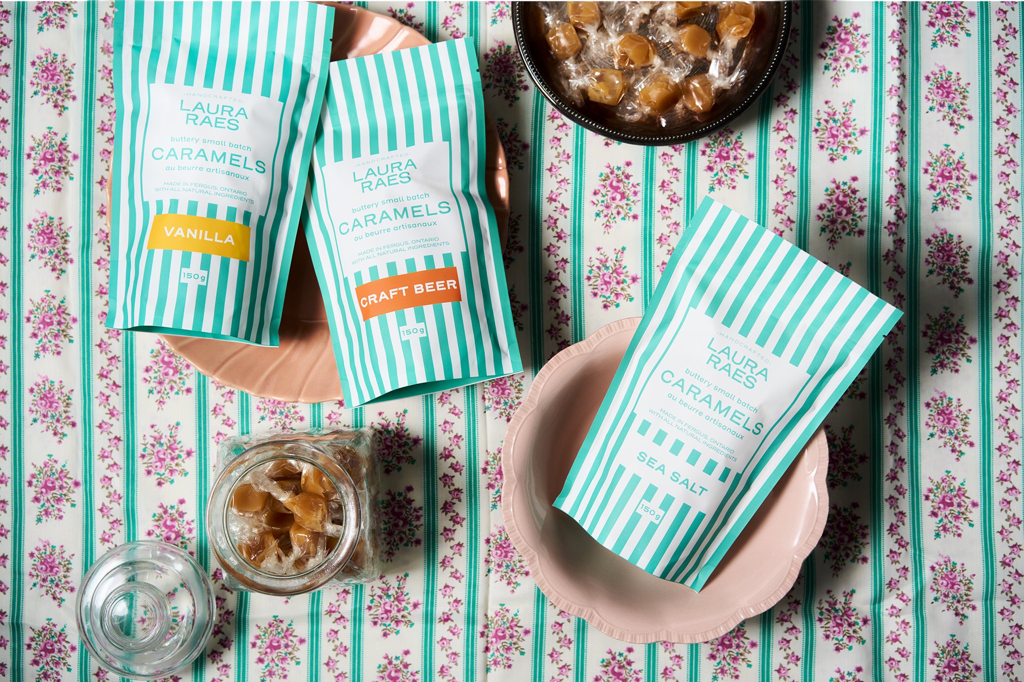
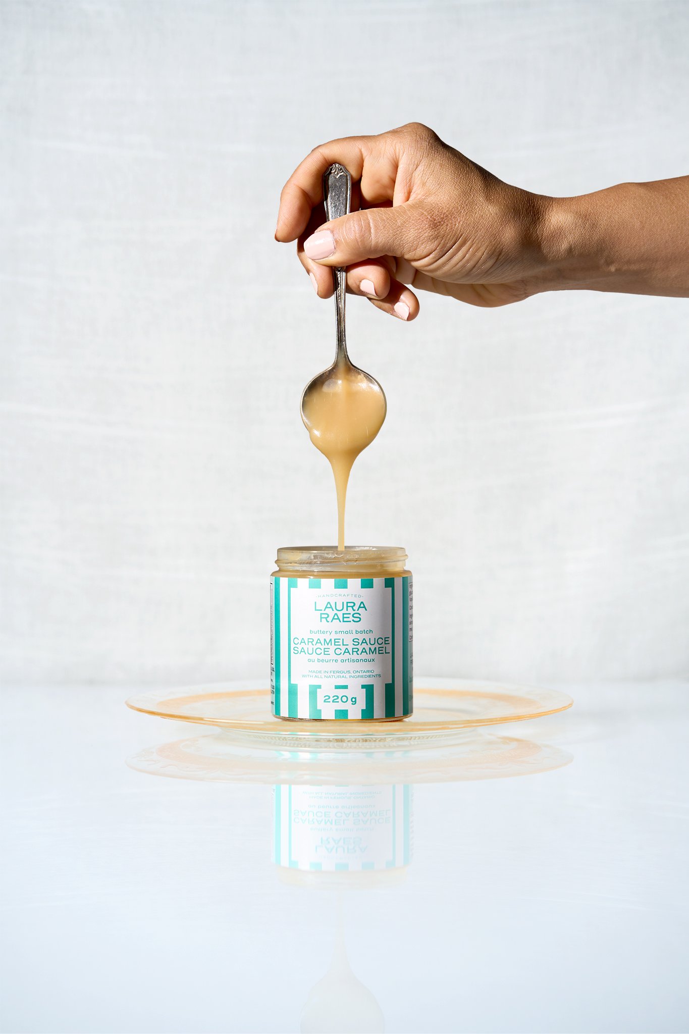
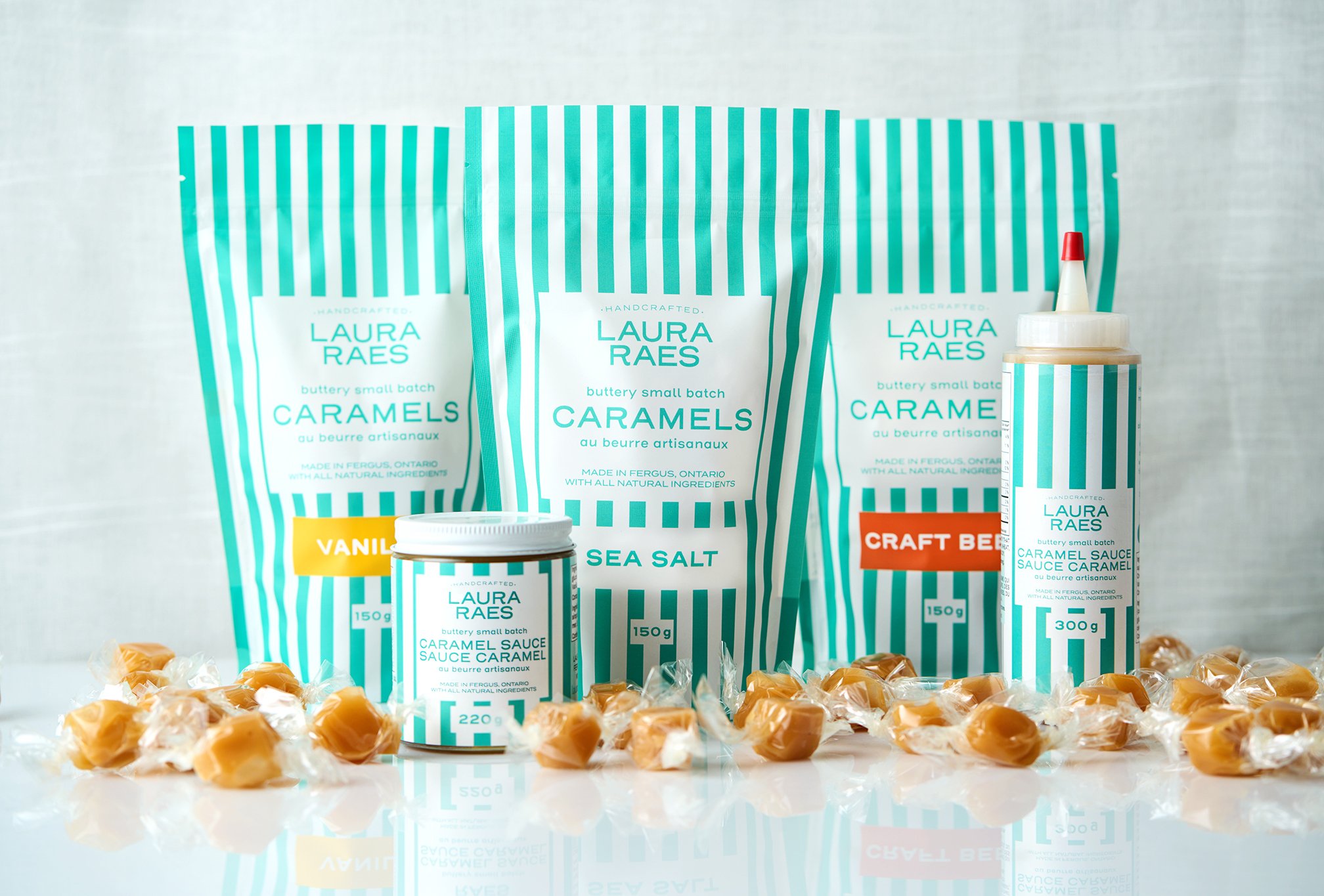
Preserving her distinct teal colour, we modernized her logo assets and created a new packaging design system, moving away from labels and into preprinted pouches. Simultaneously, we brought ingredient lists, nutrition facts and French labelling up to regulations so that business could expand unfettered.
Sheri was able to expand further into multiple retail chains, and has increased the number of gift basket companies that include her products.
CLIENT: Laura Raes Co.
More Details on this Packaging Project:
Laura Raes is a candy company founded by Sheri Visakaly during the COVID-19 pandemic. Her handmade candies became so popular that her initial labels couldn't keep up with the demand. This case study will examine how a rebranding effort helped Laura Raes meet the needs of expanding their business.
Problem
Laura Raes' initial success led to a problem - the handmade labels weren't professional enough to support the expansion of the business. In the early days of her candy-making venture, Sheri had used handmade labels that she could print at home. These labels served their purpose well enough when her candies were being sold at a few local farmers' markets. However, as the business expanded, it became clear that these labels wouldn't suffice. Sheri knew she needed a more professional look to match her quality candies.
Solution
Sheri approached Eye Candy Design to help her redesign her packaging. Our first task was to preserve Laura Raes' signature teal color while modernizing the company's logo assets. They wanted to create a new packaging design system that would move away from the handmade labels and into pre-printed pouches. This would give the candies a more professional look and make them easier to sell in larger retail chains. We also made sure that the packaging included an ingredient list, nutrition facts, and French labeling that complied with regulations, ensuring that Laura Raes could expand her business without any legal issues.
To create the new packaging, we focused on several key elements:
Color: The agency kept Laura Raes' signature teal color, but modernized it with a gradient effect that gave it more depth and dimension.
Logo: The old logo was replaced with a modern, stylized version that was easier to read and had more impact.
Packaging Design: The new packaging was designed as a pre-printed pouch, which gave the candies a more professional look and made them easier to sell in larger retail chains.
Labeling: The packaging complies with regulations by including an ingredient list, nutrition facts, and French labeling.
Results
After the rebranding effort, Laura Raes was able to expand into multiple retail chains and increased the number of gift basket companies that included her products. The new packaging gave the candies a more professional look and made them more attractive to retailers, allowing Laura Raes to expand her business beyond the farmers' markets. The new packaging also helped Laura Raes comply with regulations, ensuring that her business could continue to grow unfettered by legal issues.
Conclusion
The success of Laura Raes shows the importance of branding and packaging in the success of a business. By investing in a professional rebranding effort, Sheri Visakaly was able to take her handmade candy business from a few local farmers' markets to multiple retail chains. The new packaging not only gave the candies a more professional look, but also ensured that they complied with regulations. The success of Laura Raes is a testament to the power of branding and packaging in the growth of a business.